Color is an essential detail in learning environments as it stimulates both the mind and emotions of children. Textures, patterns, and colors all impact how space is perceived and provide graphic stimuli necessary for the development of clear, descriptive connections between visual ques and words. Since a significant amount of childhood is spent in a classroom, exposure to the abundant visual stimuli in nature is limited. This daily lifestyle highlights the importance of careful color selection when it comes to designing interior learning environments.
Listed below are the emotional impacts of utilizing applied color:
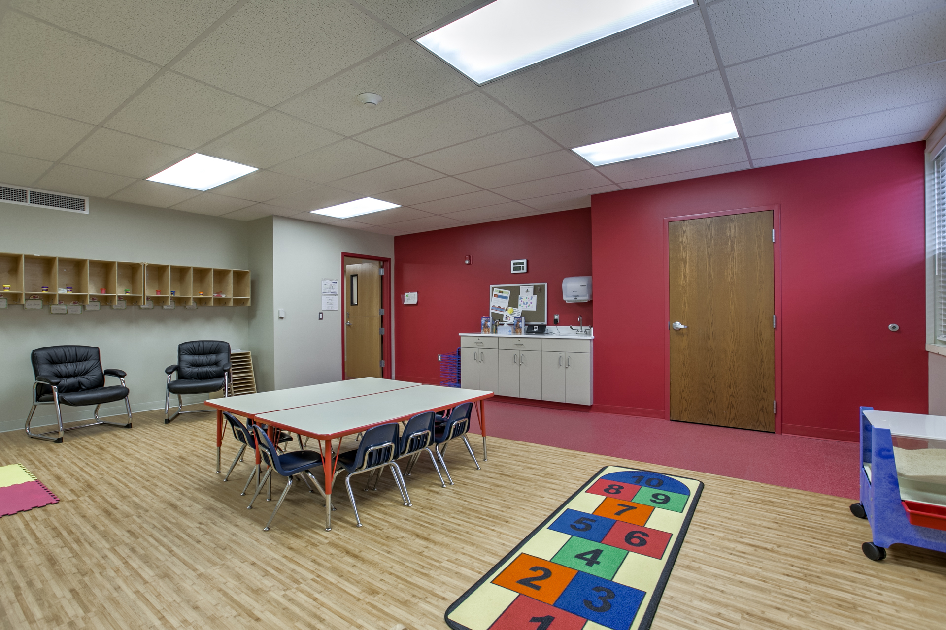
- Red – often aggressive and oppressive to anxious individuals, encourages the creation of ideas but not the implementation of them, increases alertness and restlessness by raising blood pressure
- Orange – attention-seeking and playful, suggests movement and increases appetite
- Yellow – favored color for maintaining attention, encourages creativity and positivity, beneficial effect on human metabolism
- Green – Elicits calmness, security, and protectiveness, soothing as it is the dominate color found in nature
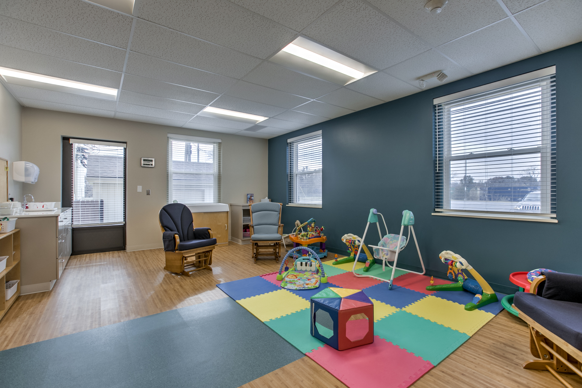
- Blue – lowers pulse rate, calms, and inhibits activity, a good choice for homes, but difficult in schools and offices
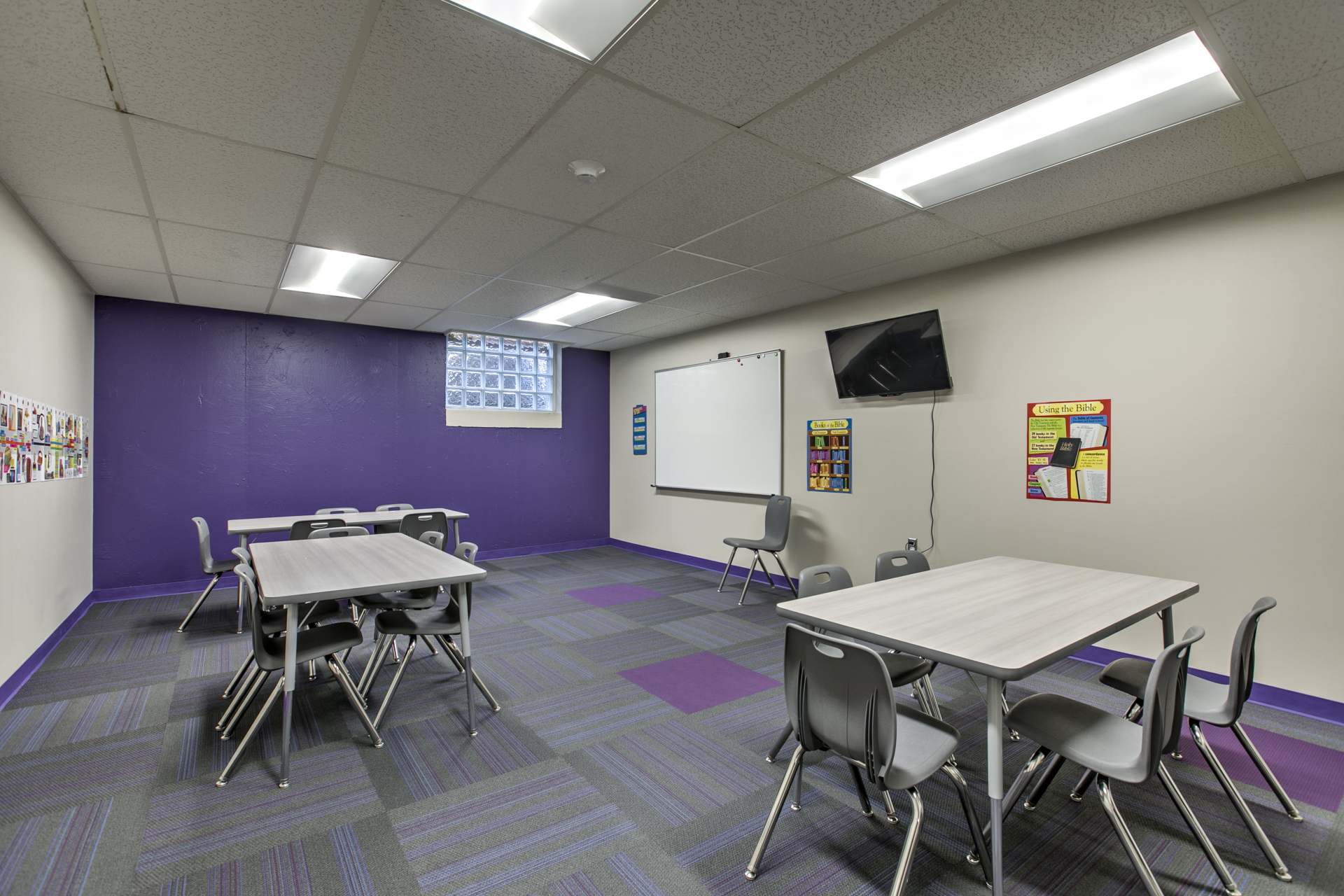
- Purple – similar effects as blue, but seen as more obtrusive, stimulates activity and curiosity
Color harmonies are an important concept in creating a stimulating learning environment. There are two broad categories of color harmony: contrasting and related. Contrasting harmonies unite colors that are on the opposite side of the color wheel into one scheme, while related harmonies are divided into monochromatic and analogous schemes. The most stable harmony of colors is a triad; triads use three colors that are equally spaced on a color wheel to form a relationship. These are satisfying and provide visual interest without being overly stimulating: important qualities of a successful environment for children. However, it is necessary to note that noncomplementary colors create asymmetry and tension. Asymmetry happens when two colors are used on one side of the color wheel without a shared hue. In nature asymmetrical coloring is rampant, but when present in an interior environment asymmetry creates unending tension if there is no visual relief from it. Asymmetry should be avoided in learning environments as it can easily overstimulate children and increase restlessness.